BRAND REFRESH · VISUAL SYSTEM · ILLUSTRATION · ICONOGRAPHY · PACKAGING · WEB DESIGN & DEVELOPMENT
Becoming new old friends.
Pelikan, a brand with heritage, decided to turn the nostalgic and old-fashioned air evoked in their customers into a fun-loving, playful one, that they could trust. Our studio, specialized in branding, was happy to take on the task of revitalizing their corporate image, ready to face new challenges.

A childhood trusted brand
Their feet in their heritage but soaring into the future with a complete overhaul of their strategy, communication, and visual identity.
Packaging

Challenge
To develop a new concept, image, and strategic vision for Pelikan. And consequently, always be ready to evolve and adapt to their customers' needs and environment, building up on their almost two centuries of experience in helping children, parents, and teachers explore the world of creativity.

My biography


From the nest to the sky
The brand’s signature is a Pelican, and luckily for us, if there’s something pelicans’ care for is their chicks. Pelican parents are all about doing their best to help their children become independent to fly and reach the sky. That’s what the concept we developed revolves around, manifesting Pelikan’s commitment in aiding parents, teachers, and children to explore and develop their minds and dreams.
No twist no fun


Solution
Demonstrate that Pelikan is a truly caring brand. Remind parents and teachers that—just as parent Pelican prepares its children to fly—Pelikan cares about making sure children use their full mental potential. Because we believe humans can fly too once the mind takes off.
So using the brand's interest in children's development, and its logo, a pelican caring for its chick, we summarized their core strategy into a simple message: Pelikan Cares.
This message divided into clearly defined pillars: “Our people”, “Our Heritage”, “Our Planet”, “Our products”, and “Learning & Education”; make up the direction of the brand's communication and blue-print.
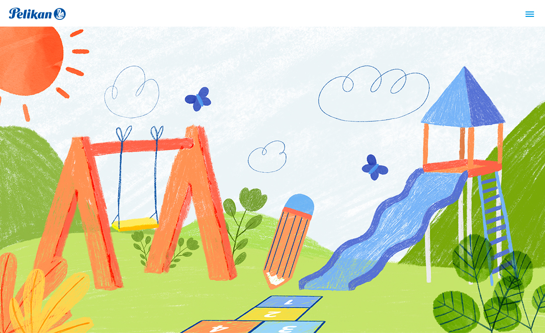
After establishing this foundation, we then redesigned the brand visual identity. We gave the brand a fresh, fun, and approachable air by using hand-drawn illustrations, choosing bright, natural, everyday lifestyle images, and adding lighter shades of blue and bright primary colors to their palette. We also created a hierarchy, with mixed styles and weights of their corporate typeface, to organize and highlight their messages.
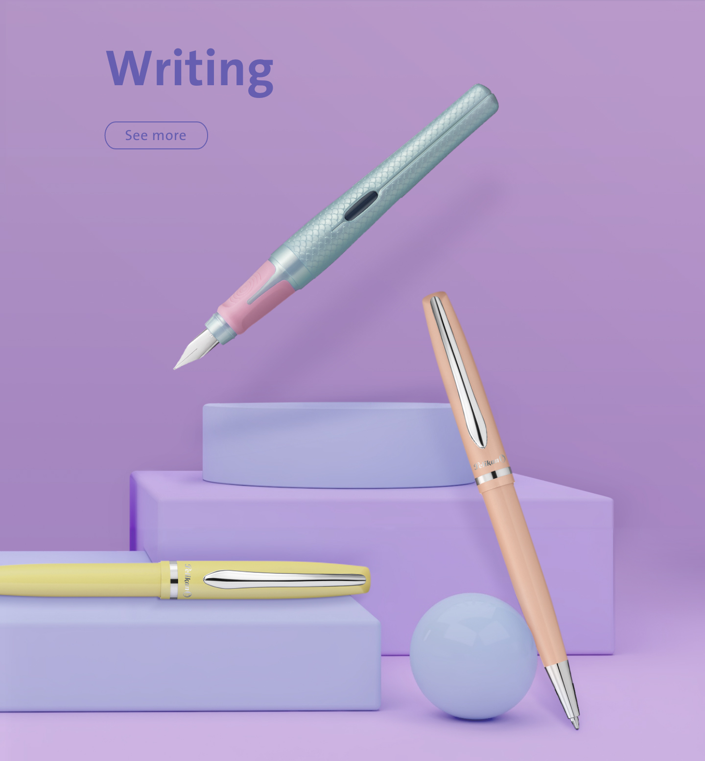
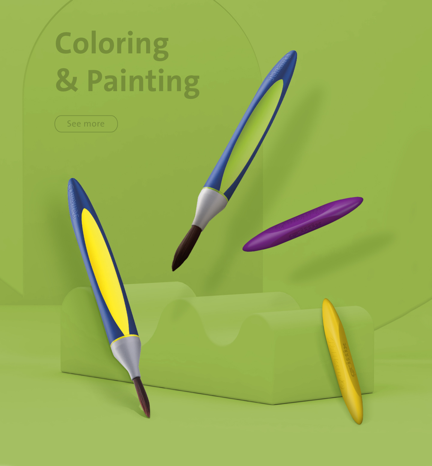
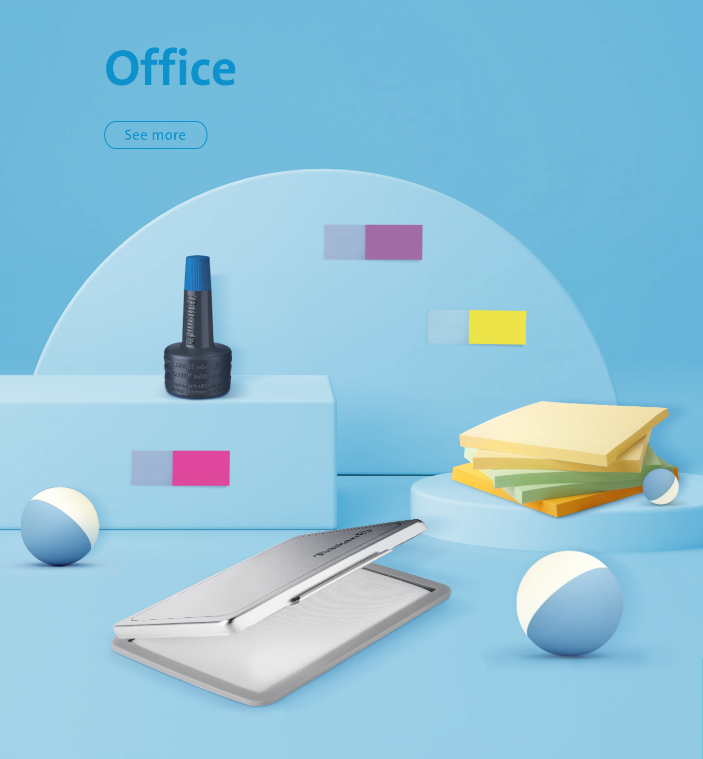
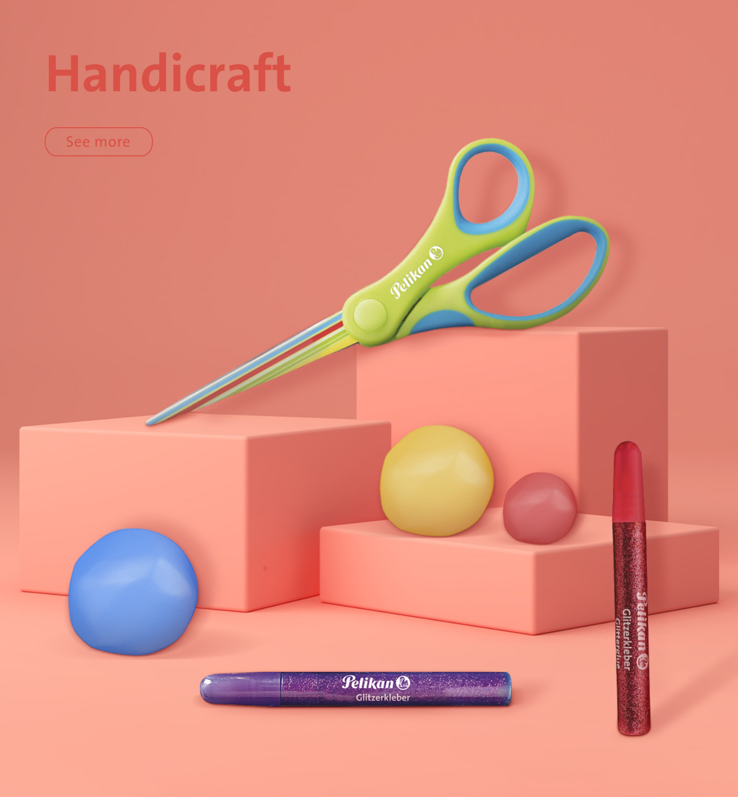
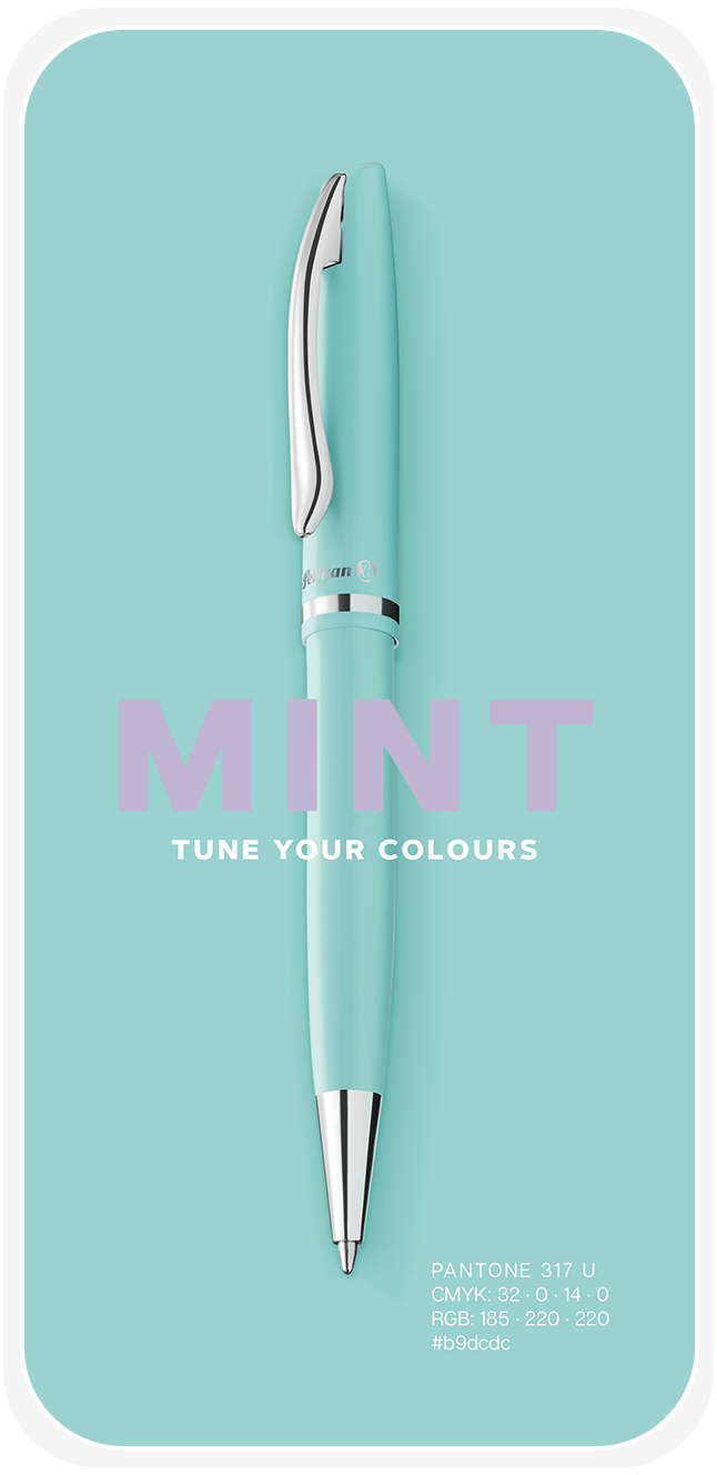
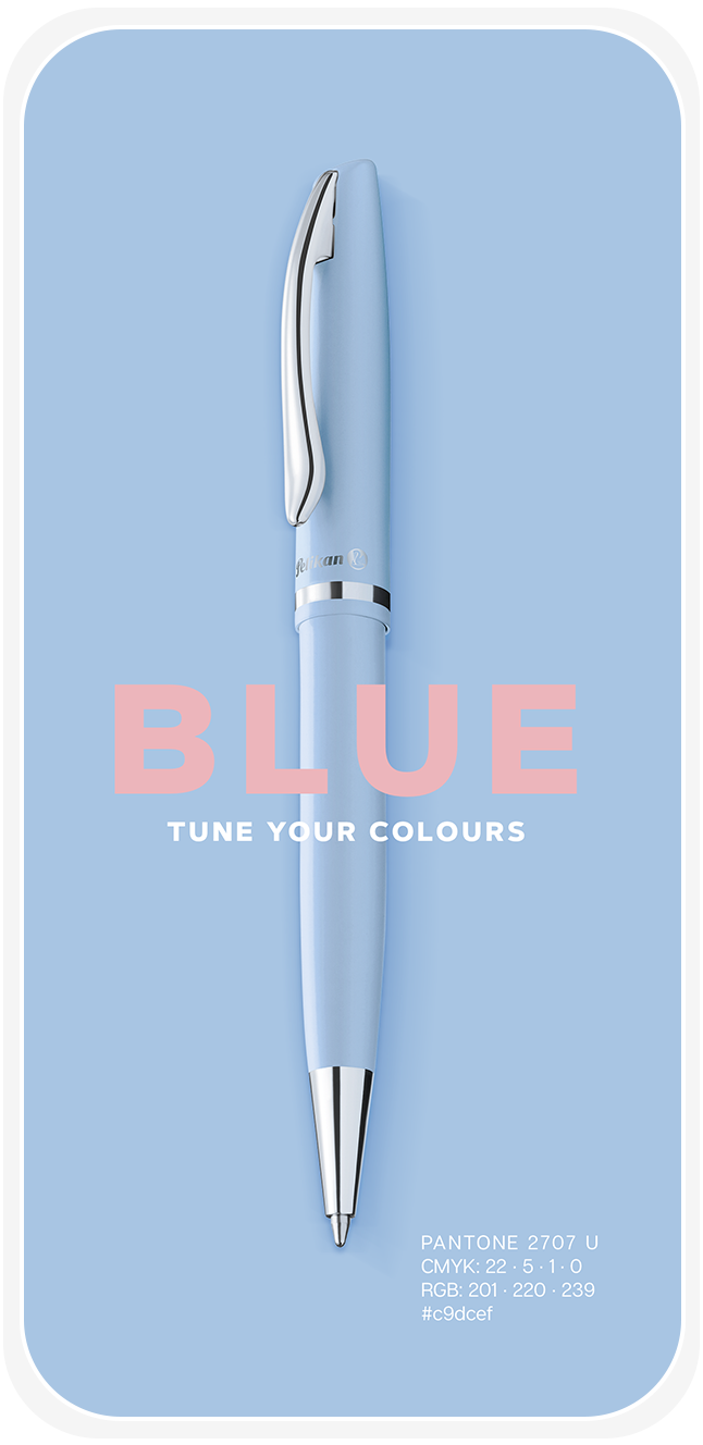
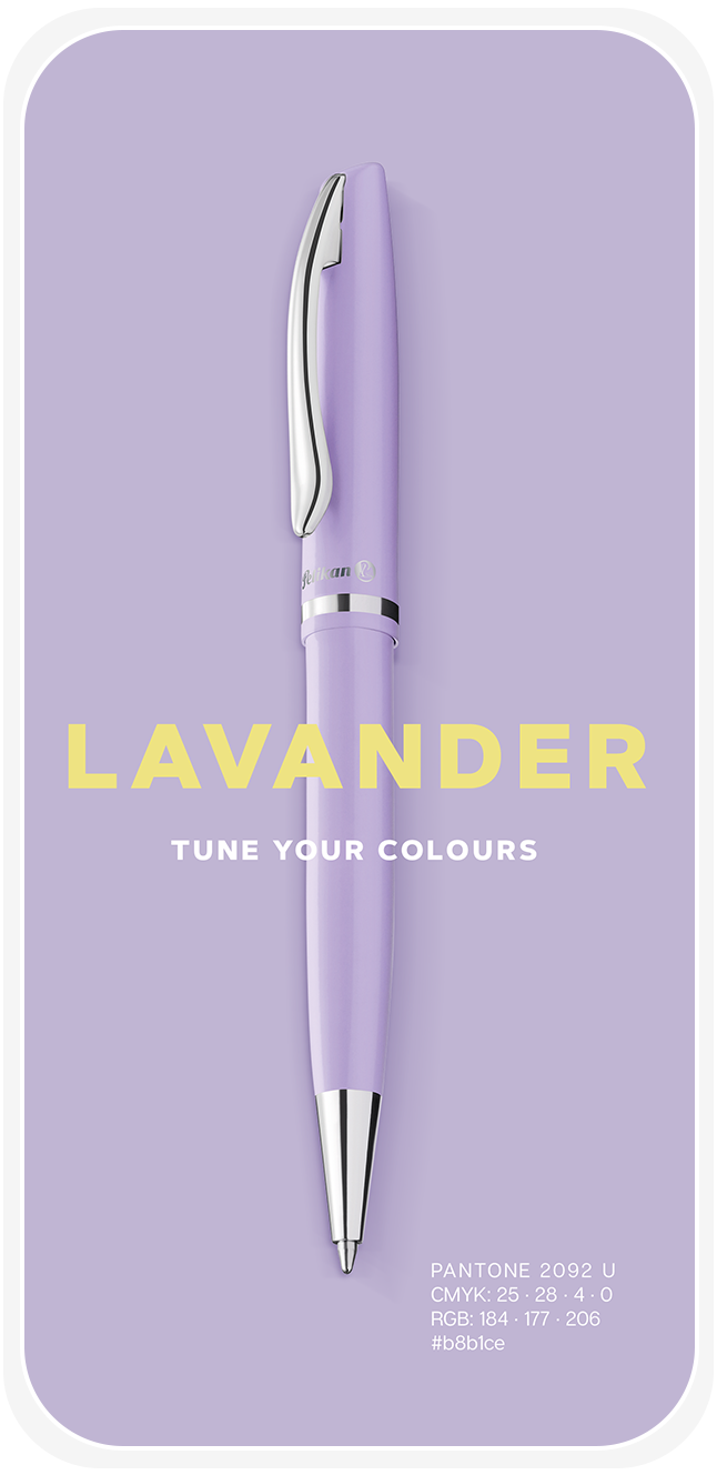
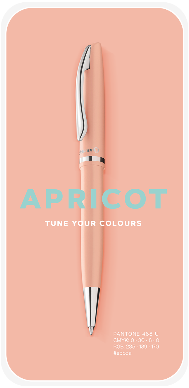
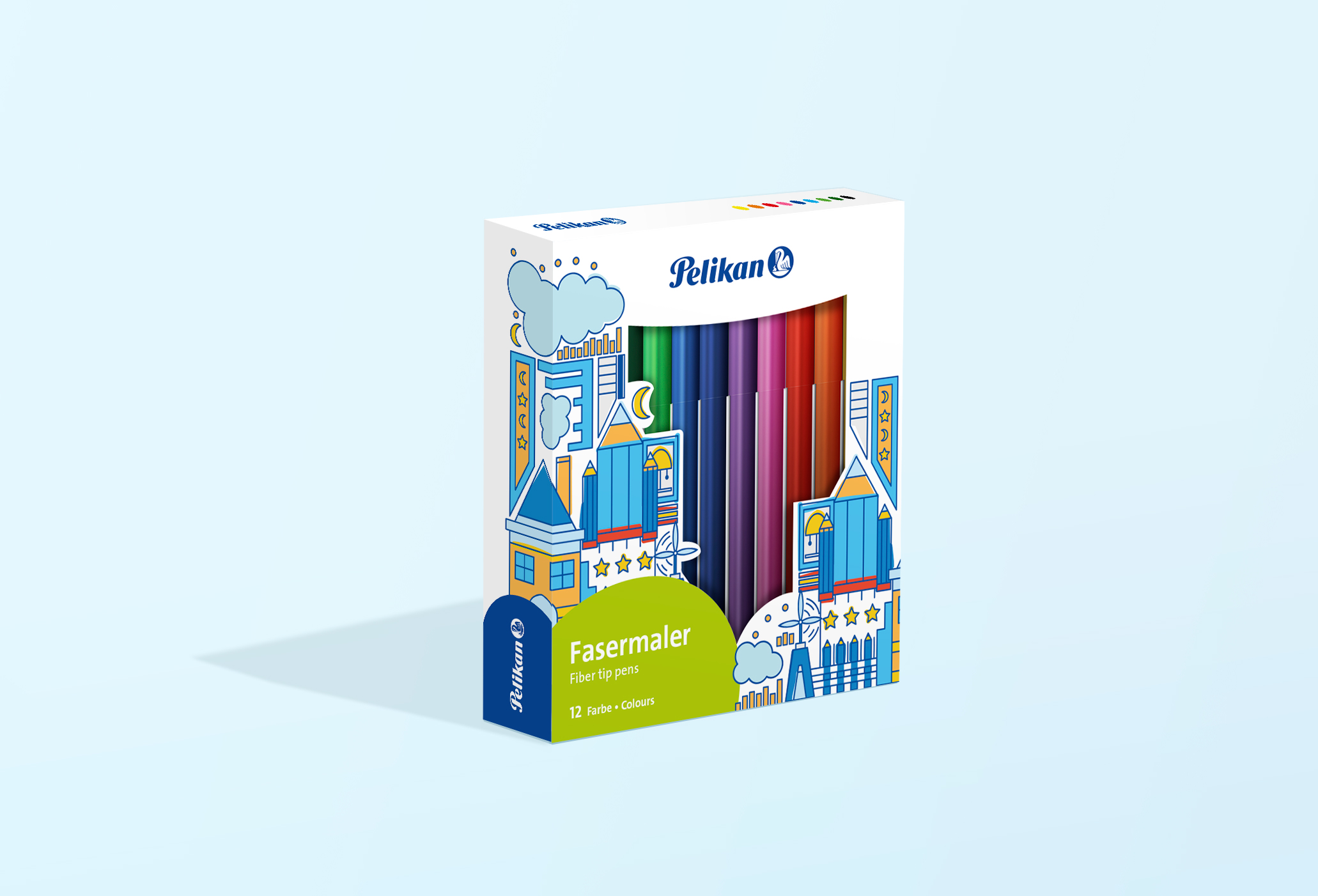
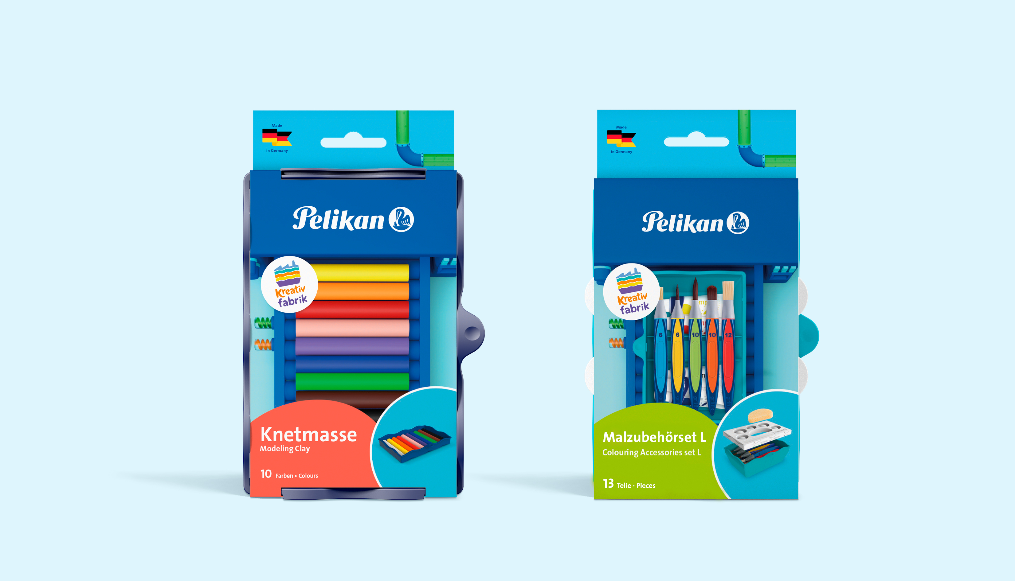
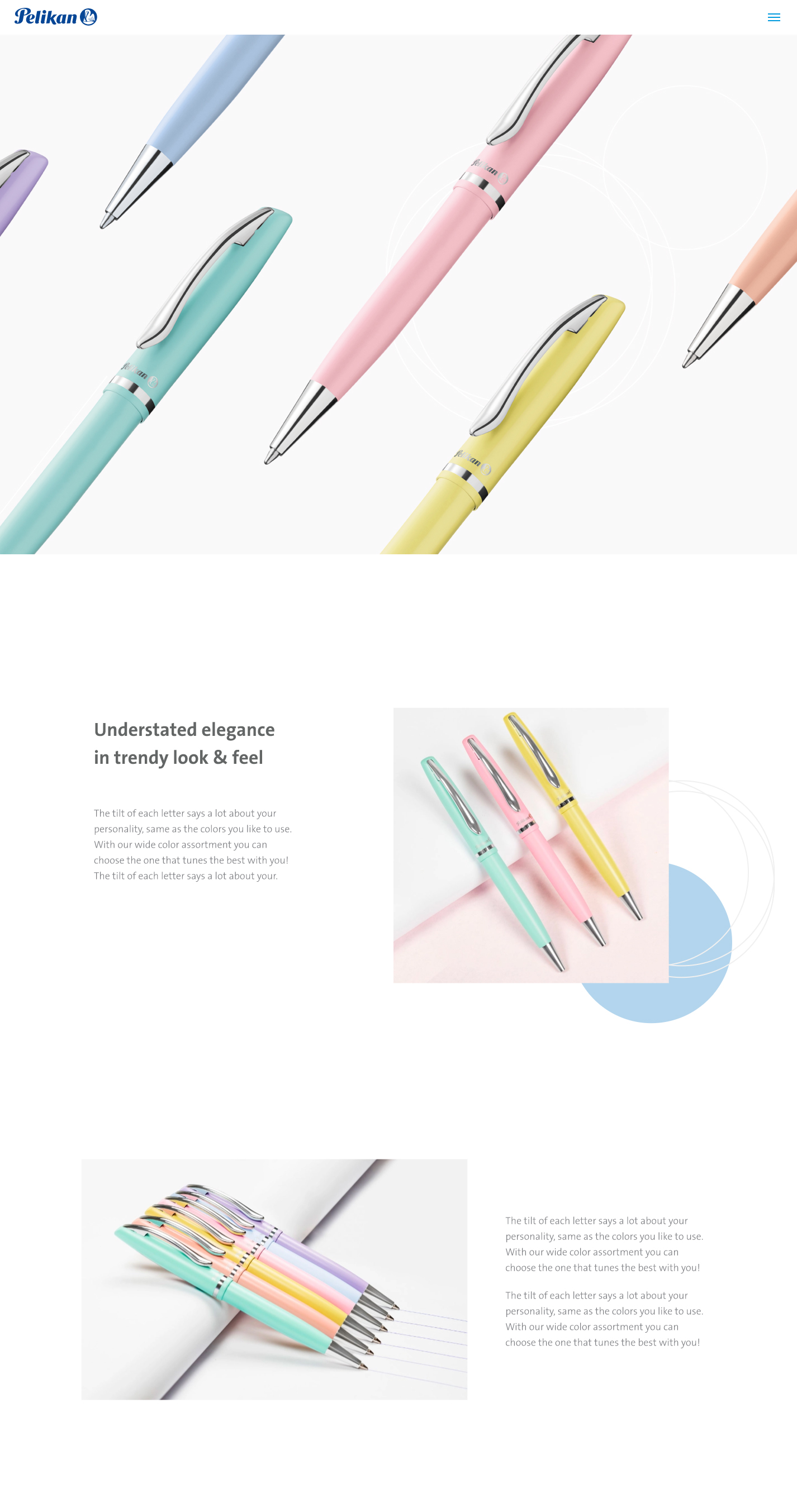
For their packaging and POS we used colors to categorize the silos the products belong to, and through the artwork used we showed what can be done with them. This way the imagined possibilities and the products are always the stars.
The result is a nice and modern visual system that can be used in their collaterals, digital media spaces, packaging, and POS.
New arrivals

After a long time in home...
Going back to school is very exciting for children
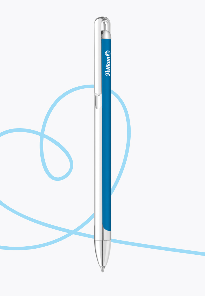
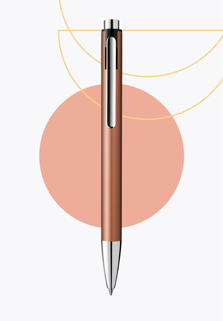
We all love stories, and Pelikan helps to create them from the very beginning by providing the right tools to make the learning process more enjoyable and fun.

