BRAND CONCEPT · PACKAGING · ILLUSTRATION · PHOTOSHOOT · WEB DESIGN & DEVELOPMENT
Time to reflect what’s truly essential
After seven years of being a part of Herlitz Group, be.bag was set up for reinvention. The goal: to become a trusted backpack for young people.
We worked side-by-side with the brand and—inspired by the much-beloved quote “What is essential is invisible to the eye”—we came up with a solution: the new identity should reflect what’s essential for the youth. By achieving this, we improved be.bag's presence in the market.
Bold. Expressive. Essential.
Our design process focused mainly on be.bag’s intention to inspire and connect with a younger audience. All through a simple message: be you.
Because regardless of what you’re passionate about or whatever you do: once you are true to your essence, everything will follow. So, you just do you and be.bag will go along with you.
be creative, be
healthy, be sporty,
be connected.
An unapologetic identity
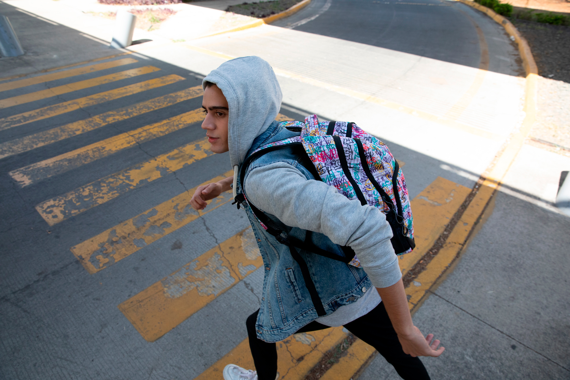
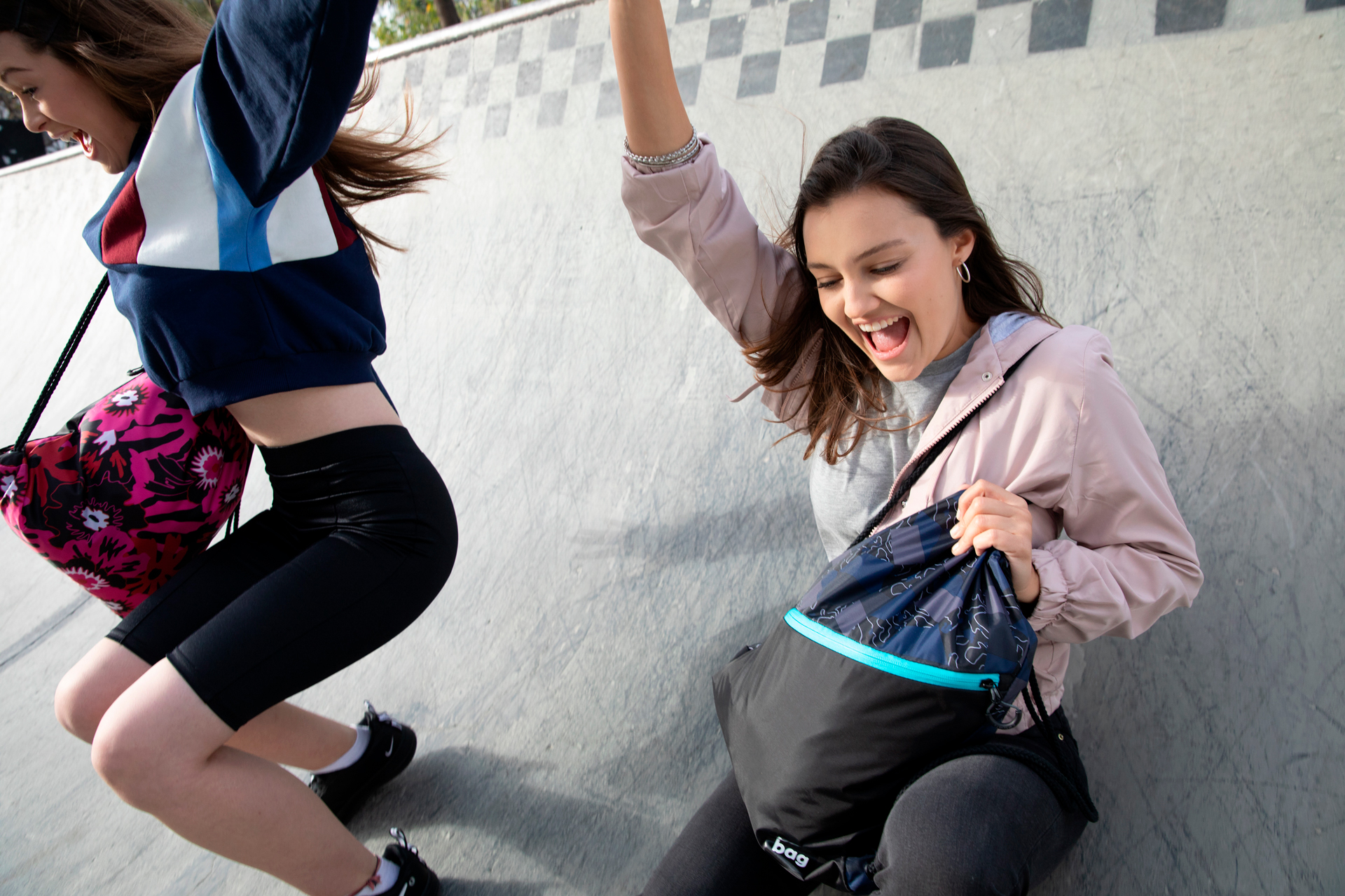
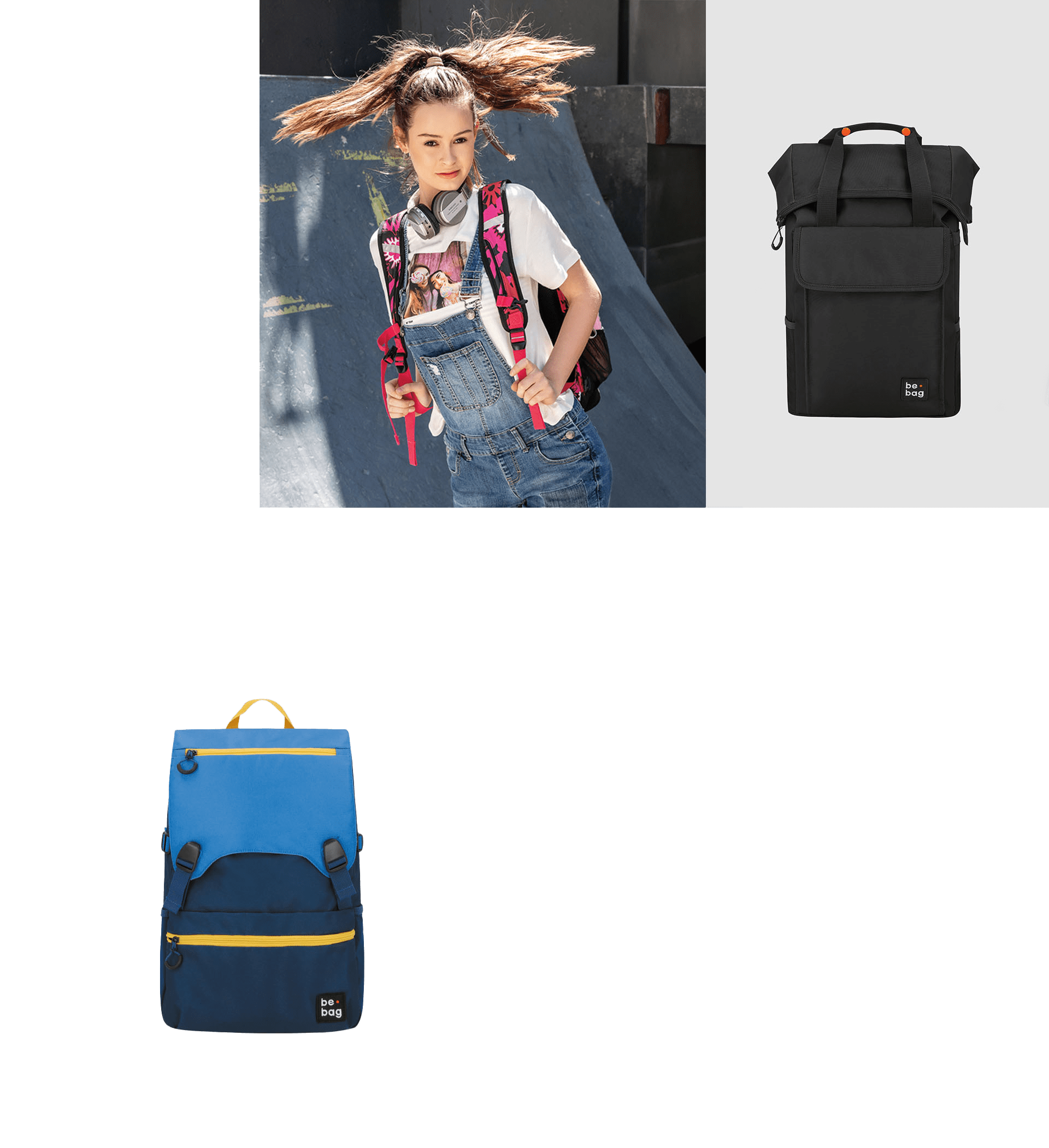
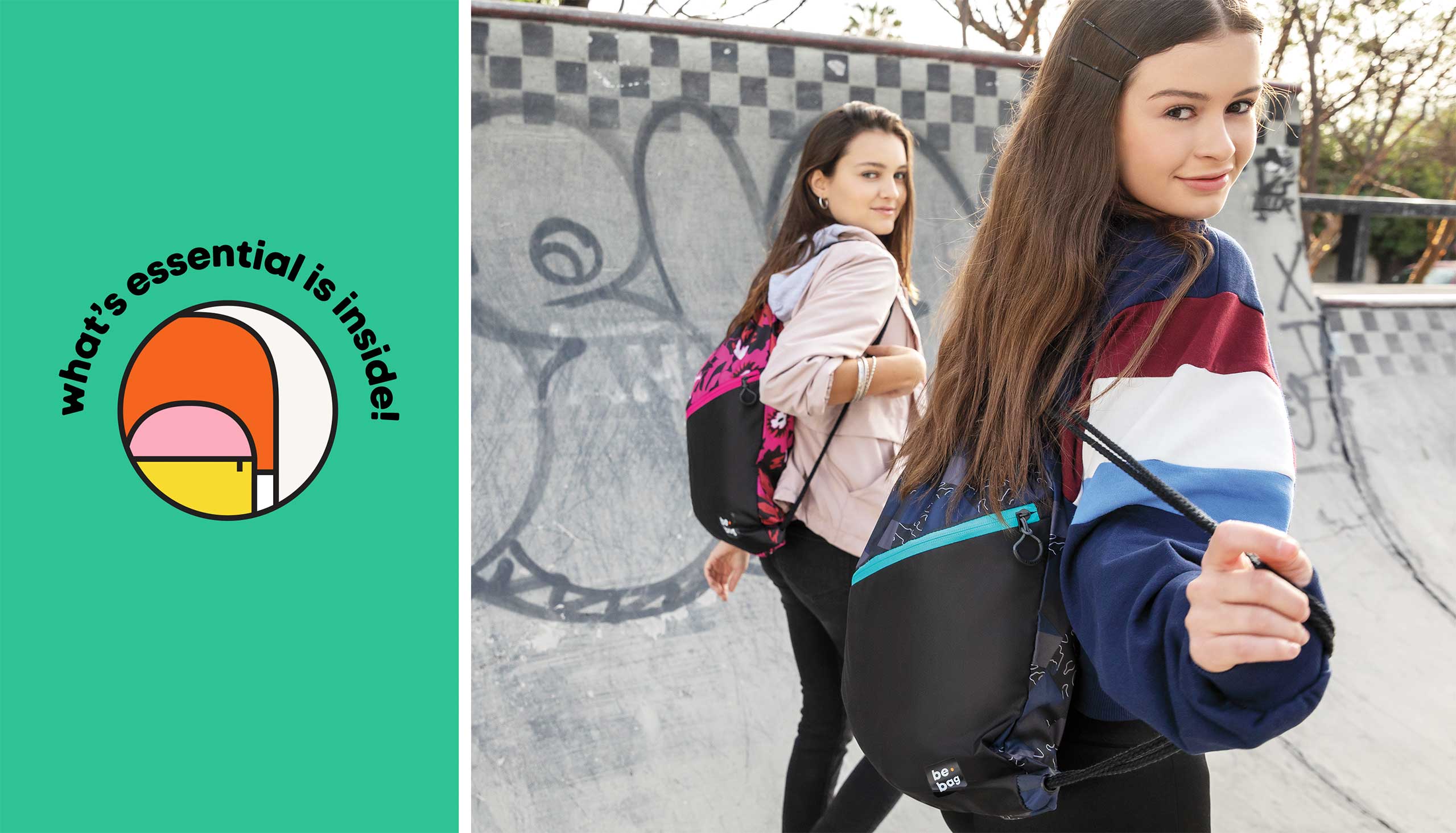
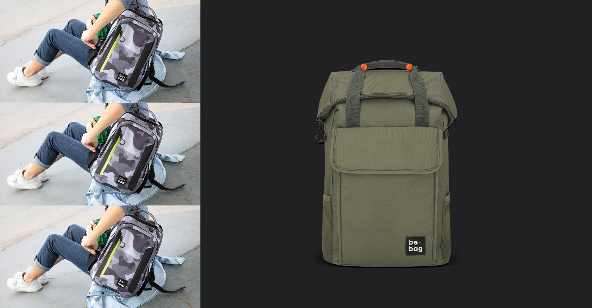
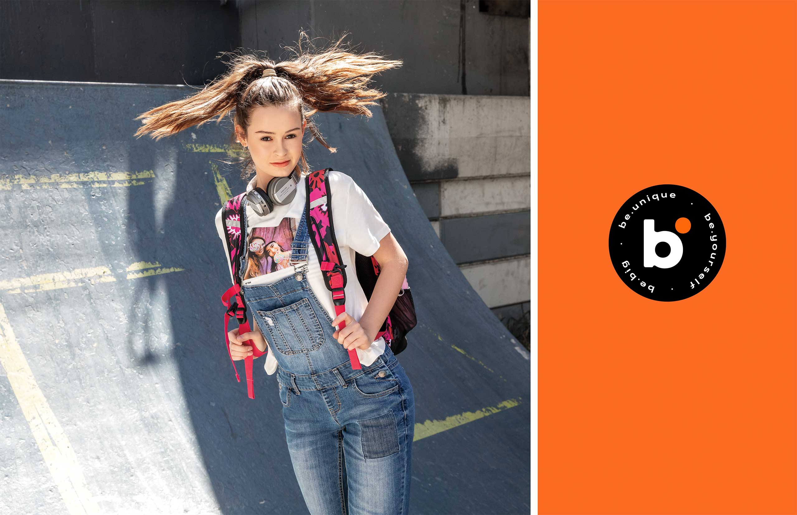
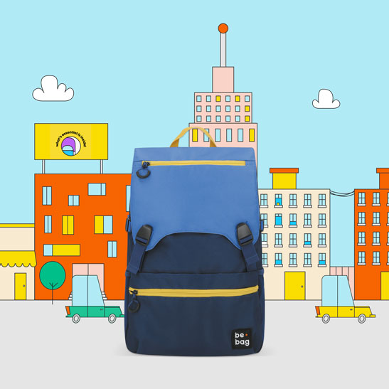
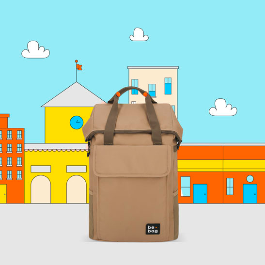
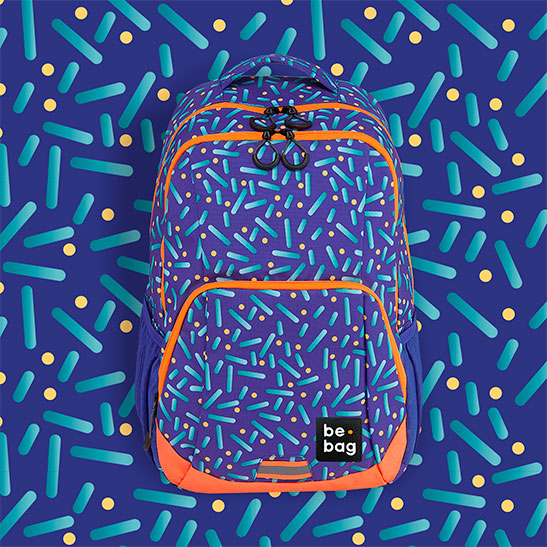
Once defined what we wanted to reflect, we picked up a bright color palette, a strong typeface, and an active lifestyle photography to design a youthful aesthetic.
Our mission: to fit be.bag’s consumers every day life and encourage them to achieve their crazy, awesome missions.



A visible and active motto
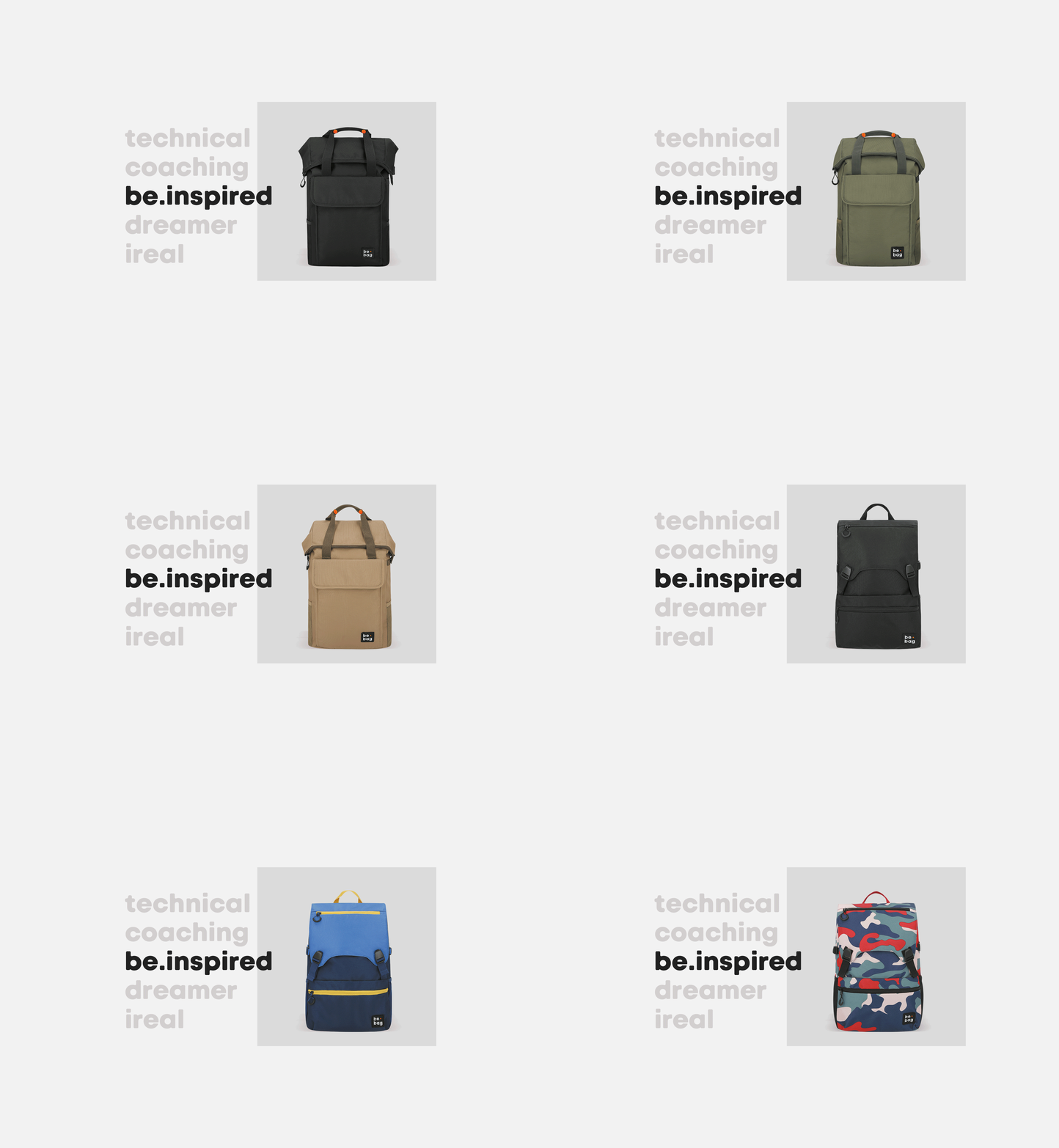
We designed two variants of the be.bag motto to sign every brand communication:
· A white version. Used mostly over product photography.
· A dynamic color version. Where the logo changed its color to match the color of the backpack.
 be.unique
be.yourself
be.big
 what's
essential
is inside
